
Random Card of the Day |
Friday, January 14, 2022Set: 2015 Bowman's Best (Rate) “ Have this card. Bowman chrome cards are always nice, but, like any chrome card, they scratch super easily.
Enjoy reading about the "best previous year game" with Bowman's Best cards.
” -jdogg1228
4
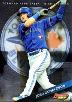
“ Very cool design on the front but there’s some wasted space on the back. I like the Toronto logo in the background. ” -pugchump
5
“ What’s it worth? ” -andrewwgregory
“ He was the best player in baseball back in 2015. ” -tinyshogun
1
“ Bowman's Best?? Bowman has done a lot better than this, this is clearly not their Best! ” -Tscastle
1
“ I usually prefer a real background (ball park, dug out), but I kinda dig the logo background in this set. ” -BigDaddy
3
“ I've always liked big team logos in the background. ” -XxCajunCannonxX
3
“ Not thrilled with this design. I won't say anymore. ” -captkirk42
1
“ For a moment I thought that was Jose Canseco by the follow through. ” -NJDevils
“ Cool card. Cool player. Cool looking swing. ” -chvlDm
“ If I'm not mistaken, this picture is the same as the one on his 2016 Topps card. Lazy! ” -curling2019
2
|
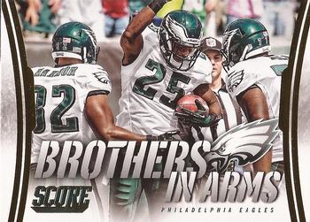
Thursday, January 13, 2022Set: 2014 Score - Brothers in Arms Gold (Rate) Card: #BA-24 Philadelphia Eagles “ The back is very plain. Cool photo on the front though. ” -pugchump
“ Brothers don’t touchdown dance. Brothers gotta hug! ;) ” -stevejrogers
4
“ That's a pretty cool card. ” -BigDaddy
3
“ i am no football guy, but thats a great looking card, nice font, nice color ” -jamestagli
1
“ Nice modern Score team card. Not thrilled about this type of insert. ” -captkirk42
“ Ah yes. The classic team-card-that's-really-a-team-card-but-claims-not-to-be. If you're going to make a team card, just go out and label it as such. ” -BigBoyOnWheels
2
“ Back in 2014, I used to date an Eagles fan. Best part? She never expected a ring... ” -XxCajunCannonxX
3
“ Score does produces some good insets, and this is one of them. Nice action shot on the front. ” -Brendan Barrick
“ confusing and hard to figure out who are the BIA's. ” -Johnf5
“ Kinda cool concept, which allows some players to be included in a card set that they otherwise wouldn't have appeared. ” -hamrlik22
|

Wednesday, January 12, 2022Set: 2005-06 Bazooka - Gold (Rate) “ I like the gold they use for these parallels but the base design on the front is very plain. I like the back much better. ” -pugchump
1
“ Pretty blah design. ” -BigDaddy
2
“ Bazooka Gold. Alright. My only real complaint about the modern Bazooka cards, maybe just the gold parallel, is the super thickness. Not sure why they did that. It isn't like they used the cards for packaging for the gum like they did decades ago. ” -captkirk42
1
“ Besides Kyrie, do any duke PGs produce/do well in the NBA? I am drawing a blank. ” -parsley24
2
“ Great player out of Duke! ” -tinyshogun
1
“ Hey didn't Rammstein do a song about this guy!?!
Du ... Du Hon ... Du Hon Chris. ” -BuccaneersDen
“ Nice for Bazooka! ” -muskie027
1
|
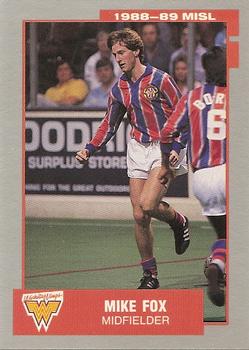
Tuesday, January 11, 2022Set: 1988-89 Pacific MISL (Rate) “ The back is nice, but the front is lame. The border is too big, colors are boring, no action shot etc. ” -pugchump
2
“ Long sleeved shirts and short shorts-that's quite a fashion statement. ” -BigDaddy
10
“ Bought a bunch of these way back when. The fact that his socks are down around his ankles makes me chuckle as that is how my socks ended up when I was playing. I wish Pacific had made these sets when Pittsburgh Spirit were still in the league. ” -Gunny
6
“ Never been a soccer fan. This guy does not look very ferocious! ” -tinyshogun
3
“ The good ole MISL. Attended many a game at the Baltimore Arena. I think I owned this set at one time, no idea where it is now. ” -Tscastle
1
“ looks like gretzky almost ” -jamestagli
“ Hmm late 1980s Pacific Soccer card design looking like some kind of late 1980s Fleer Card design. ” -captkirk42
1
“ Is that a Wonder Woman logo in the corner? ” -bevans
7
“ Haven't been on the site in a while and good timing with one of my scans upcoming! Soft spot in my heart for soccer cards having played a number of years on a couple of teams as a youth! ” -bkklaos
1
“ Okay. Major League Cricket, NFL, MLB, then this?
Okay then....
Doesn't look like he was too good, but I don't follow soccer. ” -BigBoyOnWheels
1
“ Not bad for an old obscure soccer league! Does the MISL still exist? Off to the internet for me, lol! ” -muskie027
2
|
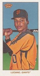
Monday, January 10, 2022Set: 2020 Topps 206 - Sweet Caporal (Rate) “ I like the old school design but oddly shaped cards are not my favorite. The design is actually really plain but I guess that’s the point. ” -pugchump
3
“ Not a fan of that design. ” -BigDaddy
2
“ The side batting stance works really well with this thin card. ” -Tscastle
3
“ These should be packaged with candy cigarettes. ” -UKboogie
5
“ Great looking cards ” -parsley24
1
“ Top 100 Prospect!!! ” -tinyshogun
2
“ Ugh. I hate this type of card. I don't know where to put it and how to store it. ” -BigBoyOnWheels
2
“ Nice Retro card. ” -captkirk42
1
|
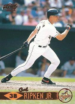
Sunday, January 9, 2022Set: 1999 Pacific - Red (Rate) “ Pacific was a great company. Great designs. ” -muskie027
4
“ Cool early color parallel. Pacific’s parallels are all pretty subtle though; they could’ve gone with some more red highlights than just this. Very cool design overall for the base card. ” -pugchump
“ Cal always had an... interesting face on the back of cards. ” -TwinKiller
3
“ I don't think I have ever seen a Pacific card before. Admittedly I've always been blinded by Topps and Upper Deck growing up.
This would be a cool card to have ” -ncarmichael22
“ Surprisingly hard to find parallel from the overproduced 90s era. No TCDB member lists as owning this and I couldn’t find it on eBay or comc. ” -Tscastle
“ Nice card for a base card collector. Full bleed action photo on front, and full career stats on the back. I can't speak for baseball but the regular Pacific set was always nice for hockey. ” -Blargh
“ Rochester Red Wings legend. ” -freakizon
“ Parallels aren't to valuable from this era because of the MANY cards/sets that were made. ” -jdogg1228
1
“ A great looking card with one of the greatest players. What's not to love about this? ” -YoRicha
1
“ Very Cool Hall of Famer ” -curling2019
“ Love Iron Man!!!!! ” -tinyshogun
“ Love the Pacific sets, and this was one of my least favorite...yet still better than a lot of the modern cards. Great memories! ” -Kleskomaniac
“ Front: Average
Back: Ergh. A horrible shade of blue. My countertops are that color. ” -BigBoyOnWheels
“ Nice Pacific card. ” -captkirk42
1
“ Three things man can always rely in on. Death. Taxes, and hideous card designs from Pacific in the 90s. ” -parsley24
1
|

Saturday, January 8, 2022Set: 1989 Topps Traded - Limited Edition (Tiffany) (Rate) “ Love Topps base sets. I never had a Topps Tiffany card. ” -muskie027
2
“ Topps 1989 was underrated. The Tiffany parallel helped elevate its status. ” -nkandy11
2
“ Tiffany was cool back in the 80s and 90s as a predecessor to modern parallels. I think they're kind of lame in a general sense as they look near identical to their base cards, but I do prefer the glossy finish to the old cardboard that decays much faster and is more susceptible to damage. ” -pugchump
3
“ game winning rbi is noted as a stat on the back, you just dont see that anymore,i loved that stat, his hit won a game!! that should be recognized, thats kind of the whole point of the game ” -jamestagli
2
“ Average design- 7/10.
The Sporting News did a Who's on First using him Jim Gott & Mike Dunne.
Ump: Is the lead off hitter ready?
Mgr: Yes, but he's not here.
Mgr: My pitcher is Dunne.
Ump: Got a releiver?
Mgr: Yes.
Ump: OK bring him in.
Mgr: No.
Ump: You said your pitcher is done.
And so on...
And hilarity ensues. ” -BigDaddy
3
“ Is Randy really ready? I don’t see how he could successfully hit a fastball or even a curve from this stance. I feel like he is waiting for an intentional ball here. In which case, maybe he is ready. ” -Tscastle
“ Who even is Tiffany? ” -NickyCollects
“ Eh. ” -TwinKiller
“ I remember ole Randy. He was a gamer!! ” -tinyshogun
“ Probably shouldn’t count for RCOTD coincidences, but it is amusing this gets opened on New Year’s Day. When people are usually “ready” to face the new year ;) ” -stevejrogers
“ That's about the coolest name ever! ” -hamrlik22
“ I forgot they made Tiffany for traded ” -mkb
“ Ergh. I know I started collecting with 1989 Topps, but after thirty some odd years, it still looks terrible. ” -BigBoyOnWheels
“ Nice card. However the back image might need updating looks like it was a miscut or off-centered card. Front should be properly cropped also ” -captkirk42
|
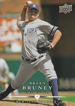
Thursday, January 6, 2022Set: 2008 Upper Deck First Edition - Factory Set (Rate) “ Very nice design, especially on the back. Also, according to Wikipedia, Bruney was an extra in Kindergarten Cop in 1990. ” -pugchump
6
“ I miss Upper Deck baseball cards!!! ” -tinyshogun
7
“ Very classy looking design. ” -muskie027
2
“ the guy has a body of a beer league softball player ” -Tmac7
4
“ This card gave me the idea to add it to BASEBALL'S BIG GUYS. Thanks, RCOTD! ” -jdogg1228
1
“ The amazing photography of these cards and the quality is stunning...really cool set to look at! ” -domentho
1
“ Love these cards! The picture fits the whole card, and I love how his head is popping out on the back. ” -NickyCollects
“ Despite throwing right handed, Brian appears to be doing his best Babe Ruth impersonation in this photo. ” -Tscastle
“ Go Yankees! ” -jayoneill
“ I thought this was a Looney Tunes Big Chungus card at first glance. Then realize it wasnt. Good looking card. Great photo minimally great graphics.. ” -parsley24
1
“ I thought it was David Wells. ” -BigDaddy
1
“ I've never heard of him and I can see why. ” -BigBoyOnWheels
1
“ Nice photo. Would have been even better without the UD logo. ” -NJDevils
“ Zoomed/cropped too much. I like seeing some meaningful background. Could use team logo on front. Back looks good. ” -chvlDm
1
“ Nice design but font on the back should be larger ” -Patrick761
|

")