
Random Card of the Day |
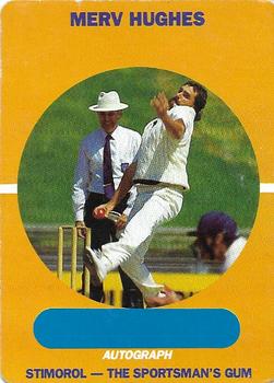
Sunday, November 21, 2021Set: 1989-90 Scanlens Stimorol Cricket (Rate) “ I have no idea. ” -chvlDm
8
“ Cricket!! I had no idea until now that they have cricket cards ” -tinyshogun
4
“ Decent for a branded set. I don’t know what kinds of stats go on cricket cards but I think they could’ve benefited from adding some here. ” -pugchump
2
“ Does the back bio really talk about his beer drinking? Cricket rules! ” -rmpaq5
5
“ Text on the back getting honest with his “amber intake”. Hilarious! ” -Tscastle
5
“ Is it just me, or does the grinning umpire behind Merv look demonic? ” -curling2019
“ The cropping and framing of the image in the front of the card- just eww. It looks like someone took a profile photo for a google account and slapped a yellow border around it. It's rather nice to see cricket cards here, but this one just looks like it was made in five minutes. ” -BigBoyOnWheels
1
“ Who can forget his 13 wicket bag against the Windies? ” -kirkscards
1
“ Looks like he has the air guitar going, plus that's a great autograph. ” -hamrlik22
2
“ Living in the USA we rarely see anything cricket related. Nice looking card sort of an homage to the 1958/59 Topps Football/Baseball designs with the picture in a circle. Looks like this set is intended for fans to collect the cards and then seek out autographs at the matches. Some people will complain about that saying they are misprinted autograph cards because there is no autograph. ” -captkirk42
2
“ Is Merv the strange old man or the guy walking like he's holding a stinky sock? ” -TwinKiller
2
“ WOW! Cricket! ” -cjjt
1
“ Honestly, I'm not sure what's going on. ” -jdogg1228
4
“ nice autograph lol ” -mkb
1
|
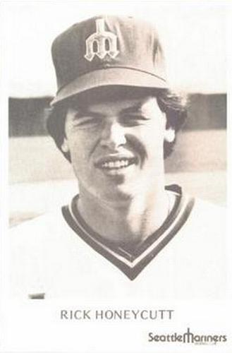
Saturday, November 20, 2021Set: 1977-78 Seattle Mariners Photocards (Rate) “ I don't particularly get excited about this. ” -muskie027
3
“ Very boring ” -pugchump
2
“ This card goes in the pile with Bryan Clutterbuck. ” -TwinKiller
5
“ "Rick stare into the sun for me I want to take your picture," said the photographer. ” -rmpaq5
“ Yes..... What a great card. ” -parsley24
“ Nice 70s photo ” -captkirk42
|
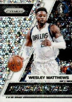
Friday, November 19, 2021Set: 2017-18 Panini Prizm - Fundamentals Prizms Fast Break (Rate) “ Oh no.... This look is better for My Little Pony set. ” -Duke
5
“ I bet this looks really cool when it’s not in a scan ” -pugchump
4
“ Beautiful card! Pretty good player, however his dad was a stud back in the day when he was on the Lakers! I really do love a lot of the Panini Prizm cards!! ” -tinyshogun
3
“ It's a horrible parallel of a good player. Wesley averages 12.6/2.1/2.9 Points/Rebounds/Assists per game. He is basically an average roleplayer on the 21-22 Lakers right now. The back (As always with this sort of promo) is basically meaningless, and the front is a bit much. All in all, a mediocre to below average card. ” -BigBoyOnWheels
1
“ How ironic this set is called fundamentals. This is so far from what the fundamentals of a card should be. ” -Tscastle
2
“ ACK A Prizm Card. This one had a more normal design than the standard Prizm but still too glittery/chromey for my tastes. Back is OK for the type of card it is. But they use the same photo ugh. ” -captkirk42
1
“ The scan doesn’t really do the pattern justice. ” -mkb
1
“ Whoa a little too busy on the front! Is that a swear word that sounds like puck on the bottom? The back is the same pic as on the front!?! Panini get out of the sports cards and stick to Soccer and Harry Potter stickers. ” -BuccaneersDen
“ Somewhat cool, somewhat dizzying. ” -muskie027
|
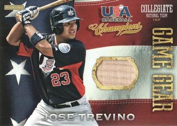
Thursday, November 18, 2021Set: 2013 Panini USA Baseball Champions - Game Gear Bats (Rate) “ I have 2 minor league relics and its an auto from a NY Penn league and a patch of a mascot. ” -TwinKiller
1
“ Nice looking card. The flag background looks nice but makes the front too busy looking, it is OK on the back. I think I have mentioned before that I am not a huge fan of the Team USA cards any sport. Odd because I do like many USA Olympics cards but not many Team USA cards. Especially in baseball. ” -captkirk42
2
“ I hate collegiate cards . . . Almost as much as I hate "Game Gear" cards . . . A swing and a miss all around ” -georgecf
3
“ The back design is bland, but I like the front, especially with a bat as the relic. ” -KalamazooCollectible
“ Bat pieces were a neat concept to add over just jersey material. ” -muskie027
“ This is pretty cool. Not a huge fan of the American flag graphics but I guess they’re fitting in this case. ” -pugchump
|

Wednesday, November 17, 2021Set: 2005 Bowman Heritage - Mini (Rate) “ In his second year, 2005, he was 5-17 with a 5.80 ERA.
Since then, looks like he figured it out. ” -chvlDm
5
“ Looks like he's busting through the wall like the Kool Aid guy. OH YEAH! ” -Id8jlb8666
16
“ in 2005 he looked like he was eight.....he has aged .... in 2021 he looks 14....great pitcher... ” -Tmac7
8
“ He left the Royals because he didn’t want to pitch for a rebuilding team. The Royals then won the World Series before he ever reached the World Series, and the two times his team has reached the WS they lost. ” -Tscastle
“ Definitely one of my favorite pitchers of all time. Mini cards are usually pretty boring but I do like the brick pattern in the background. ” -pugchump
“ I like the design a lot, probably because it’s so simple.
Also after a promising rookie year in ‘04 he led the league in losses in ‘05, being considered a bust and being moved to the bullpen.
Oh man times have changed….. ” -mkb
“ I wonder what Greinke would day if he saw this card now. ” -TwinKiller
1
“ Kind of a weird perspective, but I like it . I don't really "get" the brick wall . . . Is it supposed to have any significance or is it just a backdrop??? . . . ” -georgecf
1
“ Greinke was RCOD on 11/2 Gypsy Queen Black & White. what are the odds of the same player being pulled, 2 weeks apart, considering there are so many thousands of players across all the sports, non sports and sets? 14 million cards listed. 4 million images, Greinke has 5,023, of which 1,337 have images. I'm not a math guy any more, but I once was. I'm going to say that the odds are about 1 in 1,000 ” -abide
“ Wow Greinke looks like a 12 year old on this pitcher. 6x All-Star & Gold Glover, not too shabby! ” -tinyshogun
1
“ Love it.... 51 throwback. Perfect. ” -parsley24
“ The brick wall was a bad idea on this one. ” -KalamazooCollectible
1
“ I wonder what Greinke would day if he saw this card now. ” -TwinKiller
1
“ Brick wall make card strong, like bulll. ” -domentho
“ Bowman had Heritage? ” -muskie027
“ Something about this card just seems odd and I have no idea why. ” -jdogg1228
1
|
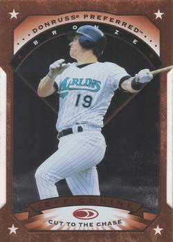
Tuesday, November 16, 2021Set: 1997 Donruss Preferred - Cut to the Chase (Rate) “ great parallel, of a great 90's set ” -abide
2
“ Cool insert. Looks like a modern card despite being almost 25 years old. ” -pugchump
2
“ I wish card makers wouldn't use set titles like "Preferred", "Finest", "Collector's Choice" et al because 99.99% of the time they are NOT. A die-cut and it's a parallel not an insert? WHAAAAAAT? At least this set back in 1997 "only" had 7 insert sets and just this one parallel set Many many times I wish things were still like they were back in the 1970s. Very few card makers, Topps had the monopoly but there was Donruss & Fleer on the Non-Sport side (a little on the sport side) and a few other strictly commemorative type companies that also were mainly Non-Sport. Topps only made one set per year for each sport during that sport's season with occasional specialty and commemorative sets, very few inserts. A few sub-sets. Plus the "team" cards had a team photo (like a class picture) not some card with an action photo of 2 or more players on it that is labeled a "team card". Also real checklist cards that were accurate. ” -captkirk42
8
“ Looks like it could be cool, I know nothing about this one though. ” -muskie027
“ Cut to the Chase? Who are you? Joe Hollywood? ” -DanD
2
|
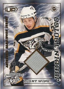
Monday, November 15, 2021Set: 2003-04 Pacific Heads Up - Game-Worn Jerseys (Rate) “ The NHL’s first Inuk player. Very cool. ” -pugchump
7
“ With a set name like "Heads Up", it is too bad this is not a helmet memorabilia card. ” -Tscastle
2
“ Heads UP is a good title for this set there is A LOT going on with it. Front TOO busy. OH look it's a relic card that fact could have been lost in the ice storm of this card design. Sideways lettering UGH. Back looks OK a bit plain but looks good. OOH and a serial number good I think all relic cards should be serial numbered. Better than serial numbering the color parallels. ” -captkirk42
2
“ Great thing about early Pacific efforts like this were they would put a piece of memorabilia in a card and then tell you when it was worn on the back. Nowadays, it's just "it was worn somewhere by someone". ” -hamrlik22
“ One of the better looking jersey cards. ” -NJDevils
“ He was one of the best agitators out on the ice and the first Inuk to play in the NHL. This is a great card!! ” -tinyshogun
“ "Mr. Owl, how many jokes will be made about this player's last name on the Trading Card Database?"
"Ah-one...Ah-twoo...Ah-Threeeeee...CRUNCH!" ” -curling2019
|
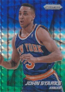
Sunday, November 14, 2021Set: 2014-15 Panini Prizm - Prizms Blue and Green Mosaic (Rate) “ Cool refractor ” -pugchump
2
“ Really cool looking card. ” -muskie027
1
“ He's as surprised as I am that his card looks halfway decent. ” -BigBoyOnWheels
5
“ Like the card. I don't think Panini gets the recognition they should for their cards! ” -tinyshogun
2
|
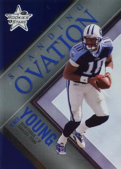
Saturday, November 13, 2021Set: 2007 Leaf Rookies & Stars - Standing Ovation Blue (Rate) “ i like how the front design mirrors the back design. The colors work. This works as a insert set but I wouldn't like it for a main set. ” -davidhandberry
1
“ I wish the front and back weren't the exact same but it's a pretty nice design either way ” -pugchump
“ Me! 1 of my cards!
I always thought Vince Young's talent was wasted in Tennessee. He should have been a superstar ” -cjjt
3
“ This was a good product when Leaf produced it. Not so much when Panini took over. ” -hamrlik22
|

")