
Random Card of the Day |


Thursday, December 28, 2017Set: 1981 TCMA El Paso Diablos (Rate) “ Neat uniform! Seeing it instantly made Marty Robbins' song pop into my head. Not sure that Hobo Joe's logo screams fine foods, though... ” -Billy Kingsley
“ All it needs is a nice home in someone's collection. ” -Sportzcommish
“ Whoa. Those uniforms are straight-up FIRE! ” -mkaz80
“ Combo uniform....Pirates, Mariners and the Washington Redskins. Love it....this very simple card is slice of Americana from my boyhood era in Baseball. ” -tbshaw
“ Name : Weldon Swift Team: El Paso Diablos Sponsor: Hobo Joe's Coolness: Off The Charts ! ” -uncaian
“ I always loved the El Paso uniforms. Classic 80s minor league ” -jasongerman9
“ Hobo Joe's is the homeless Big Boy of restaurants. ” -UKboogie
“ From the team name to the player name, this is a collectible card. Great minimalist design. The type of guy you would open a cold one with the guys with... 7th pick in the 1978 draft from Miami-Dade College. 4 of the top 7 picks came from Miami Dade college that year. That team must have been awesome to watch. ” -parsley24
“ Those colors! Great scan. I really wished TCMA had actually put some facts on these "Fact Cards". Couldn't even get birth dates! Still, I'd love any of these older sets. ” -vrooomed
“ On the back Hobo Joe's is the King of Fine Foods! Who knew? ” -carthage44
“ Wow what a uniform. Nice early 1980s Minor League card. Oh of course its TCMA. ” -captkirk42
“ Amazing. Uniforms. ” -wax_house
“ I love everything about this card. The uniform, the cap, the player's name. I want this. ” -switzr1
“ Now that is a uniform! Standard for minor league, but I still would have enjoyed some stats. ” -muskie027
“ Nice vintage MiLB. Love the uni, despite the pullover top. ” -kents_stuff
“ I wonder if the back of the jersey says Chico's bail bonds ” -rmitchell6700
“ Like the Winnipeg Jets sweaters from the 1980s and 1990s, this uniform needs to come back! ” -beansballcardblog
“ The uniform looks like it was excess material from Chico's Bail Bonds. Weldon also looks like Tom Cruise. ” -jupiterhill
|

Wednesday, December 27, 2017Set: 1989 Continental Candy Company Snoots (Rate) “ Uh, what?!? ” -trauty
“ Now I've seen everything ” -olerud363
“ What the??? Oh well....hard to really hate this one. A little early morning comedy is always a good thing. ” -tbshaw
“ Humorous, yes. Collectible, no. ” -Sportzcommish
“ Well, this was a bit disappointing to open up as the card of the day. The artwork though is very cracked/mad magazine-ish which takes me back to my youth of reading these mags. Did anyone else notice a smell to their cracked magazines? i could never put my finger on it, but there was a distinct odor to those mags. ” -parsley24
“ My Polish nose would not fit in there. ” -carthage44
“ Hehe. Cool Non-Sport Novelty type activity card. ” -captkirk42
“ ....I'm not really sure what to say here ” -Lennoxmatt
“ I have no words for this masterpiece ” -Bargunmaster
“ Absolutely ridiculous. I love it! ” -jayoneill
“ I have no idea what I'm looking at. I hope I never see it again. ” -switzr1
“ I do not even know where to begin... ” -702tpr777
“ Nope , nope , nope ! ” -uncaian
“ And I thought it was just cards from a smoker's home that were prone to yellowing over time. ” -DanD
“ Oh my!!! OK, Dude is reporting in a war zone, during a hurricane and wildfires, while they are filming Sharknado 5. All the while home boy is standing in water with an electrified microphone, with the possibility of poking his eye out with that sharp pencil, but he is SAFE from anthrax. What in the world is going on here?!?!?!?! Quite possibly the best Random Card of the Day EVER!!! ” -RoyalChief
“ Oh....my....God! ” -rmpaq5
“ Huh? I don't even know what to say. ” -muskie027
|
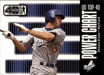
Tuesday, December 26, 2017Set: 2002 Upper Deck 40-Man (Rate) “ The design does nothing for me, but I love the fact that there's a card set that has more than 1100 cards. Wish my sports got that comprehensive coverage. ” -Billy Kingsley
“ Wait...30 teams x 40 players is 1200 cards. Then why is this set only 1182 cards including checklists and subsets such as this card? ” -rmpaq5
“ I do love me some Shawn Green! ” -jasongerman9
“ Great photo, but not a lot going on for how much area is taken up with graphics. 6/10 ” -parsley24
“ Chalk his power up to steroids. ” -carthage44
“ I'll collect these as part of my player collections, but otherwise ignore what looks more like an advertisement than a trading card. ” -Sportzcommish
“ Not sure what this is trying to celebrate. Top 40 Power Players? Hmm the same pic front/back. Just for fun and giggles I went back and forth with my mouse and Shawn sort of shimmy shake dances. LOL. It was fun for about 10 seconds. ” -captkirk42
“ Always like the idea of this set. But there are a lot cards. ” -kirkscards
“ What's wrong with this card? Let's start with same photo front and back. Next we have front lettering, up down and sideways. Next we have it simply sucks. ” -NJDevils
“ Decent card of a thin but powerful left-hander ” -switzr1
“ You know, I grew up with 660 cards in a baseball set, and then they changed to 726. And I got used to it. And then 792. And then a bunch of parallels. Etc. Etc. And here's card #1107 from a set. Way too many. Sorry. ” -kents_stuff
“ A poor effort. The front wasn't too bad for an insert, but the back is a repeat of the front with words. ” -muskie027
|

Monday, December 25, 2017Set: 1994-95 Collector's Choice - You Crash the Game Rookie Scoring Exchange (Rate) “ I liked the old redemption cards from this era. And the wrapper offers. Any thing that could get me additional cards that weren't in packs was always fun. And fun is what a hobby is all about. ” -switzr1
“ Hmm? On a day when Chris Webber is featured on RCOTD we get to Write One for Jalen Rose? Again, hmm? Random? Yeah, random. ” -Sportzcommish
“ Nice fab 5 coincidence. Writing about Jalen Rose, while today's RCOD is Chris Webber. Decent design, though truthfully I have no expectations when it comes to 'fun cards'. Whatever happened to Eric Montross? ” -dilemma19
“ As we say in Jersey, "crash this". ” -NJDevils
“ Kind of an odd design with his own head blocking out his name. The background reminds me of tv static. ” -Billy Kingsley
“ The "you crash: graphic is too cartoonish for my liking. I feel sports cards really went down hill with these types of designs. And the background reminds me too much of poltergeist. I still cant let a tv go to that screen without fearing Indian coffins are going to pop up from my pool. ” -parsley24
“ Not a true coincidence, but comments opened for this card the same day that comments were displayed for a Chris Webber card. As a Buckeye fan, that doesn't make me happy. If we get Juwan Howard opened when Rose is displayed then I'll cry conspiracy. ” -Brimose
“ "Crash the Game" I'd rather not. I first heard of these (from the Football set) about 10 or 15 years after the fact. Apparently if you were following the current season when these were released you could win stuff if you got the appropriate card before the end of the season or whenever the deadline for the contests were. ” -captkirk42
“ Ironic to me that as I'm typing this we have a Chris Webber up as RCotD. ” -jasongerman9
“ His best years came in Chicago. ” -carthage44
“ Maybe don't give the guy with the DUI conviction a card that says "You Crash." ” -royals
“ A bit ironic as I am writing this review of the Jalen Rose card on the day that the RCOTD is actually Chris Webber. Fitting, however, that I am getting paid just 1% of what I got paid on the Webber card, though. ” -kents_stuff
“ I really don't like the way he is photoshopped in front of his name and team. ” -rmpaq5
|

Sunday, December 24, 2017Set: 1996 Metal Universe (Rate) “ That is all sorts of ugly. Its a shame too because I like the back. I also liked those Pirates uniforms a lot too. ” -jupiterhill
“ Metal Universe was so bad, it's good. ” -switzr1
“ Is this a Picasso or some form of modern art? Oh no, it looks like his body is coming apart, starting at the chest! ” -muskie027
“ One of the most bizarre set concepts ever. And Fleer used it in at least three sports! ” -Billy Kingsley
“ This card scan terribly. Good player, terrible design, sums up mid-nineties baseball cards pretty well to be honest. ” -JoshReese92099
“ Which Aaron Rodgers rookie cards are fetching the most right now ” -Ericb34
“ First impression was that Bell was running through a fall windstorm flailing leaves at him - not Metal Universe's intent, I'm sure. So I checked out my Astros in this set and find some very attractive cards, particularly the Bagwell and Biggio, and thusly they have been added to my Want List. Good thing Bell wasn't an Astro, though. ” -Sportzcommish
“ I like the back, but don't get the front. Did they make it out of barbed wire? ” -kents_stuff
“ These were cool when they came out and I was 12 years old but I no longer think they are very cool. ” -carthage44
“ What the heck is happening? ” -wax_house
“ I never seen one of these in person. Maybe it just the scan. It just does not look good. ” -kirkscards
“ horrible looking card. the whole metal thing is awful in all the cards i have seen that have tried to metalicize themselves.. ” -parsley24
“ Terrible. Plain and simple ” -rmitchell6700
“ Terrible concept. The back of the card looks great, but the front is a nightmare. ” -mkaz80
“ Clean barf off cards before submitting scans. ” -NJDevils
“ ACK its a Metal Universe card. Not a fan of these. If they were in regular ink not the metalized chrome whatever they are I might like them. Back is OK not great. ” -captkirk42
“ No thanks. Seriously, this is terrible. ” -IfbBirdsCards
“ I've never seen one of these, but I'm thinking it's got to be pretty cool. ” -Doe MG
|


Thursday, December 21, 2017Set: 1991 Impel Marvel Universe II (Rate) Card: #152 Avengers West Coast “ Although I prefer DC over Marvel, they have always had better cards than DC. Apparently the guidelines stating properly cropped does not apply to whoever posted the scan. There is no white border on the top of the card. ” -Billy Kingsley
“ One of the few non-sport sets I still own. And West Coast Avengers #6 was the first Marvel comic I ever bought (excluding licenced properties such as Star Wars, GI Joe, and Transformers). Impel would of course change its name to Skybox about a year after this set came out. ” -bevans
“ I prefer the East Coast Avengers. ” -carthage44
“ No.... This was when there were just too many weird parallels and cards and card sets. ” -parsley24
“ Cool Non-Sport. Ah The Avengers West Coast. When this title first started I was still majorly into comic books. I have quite a few of the first few issues. I'd have to check the box they are in to see which ones I actually have. The Marvel Universe card series is pretty good. If I recall it was pretty well balanced, not Spider-Man heavy or Capt. America heavy like other Marvel Comic sets are. Impel was a good card company. It was bought out by Skybox which in turn, as many card collectors know, got bought up by Fleer. ” -captkirk42
“ Thank the lord the MCU didn't use "classic costumes." ” -rmpaq5
“ Don't confuse us with those East Coast Avengers - we want NOTHING to do with those guys. ” -royals
“ Who's the guy in pink? ” -Sportzcommish
“ Hmmm. Nope. Prefer East Coast Avengers. ” -Joshua825
“ I had NO IDEA about the annual softball game! Do they still do that now, 25+ years later? What's the series record? ” -kents_stuff
“ Um, maybe the East Coast was cooler? I am unfamiliar. I am not opposed to comic stuff, just to be clear, I even like a lot of it, I just don't know this bunch, except for maybe is that Iron Man in the back? ” -muskie027
|

Wednesday, December 20, 2017Set: 2000 Donruss - Dominators (Rate) “ Not bad. Not great, but not bad. ” -switzr1
“ It's finally NOT a hockey card! That was a weird streak of same-sport cards. As for this card, not bad but also not great. Awesome pic on the front, nice pic on the back and an SN on the card. But the design is weak and there are no stats at all. If I was rating this card on a 10-point scale, it would get a 5. That is ONLY because of the pics though! Otherwise, I'd rate it lower, ” -spazmatastic
“ Not a bad insert design, but why is DOM so big and bold? It looks funny. Weird funny, not haha funny. ” -Billy Kingsley
“ It's Emmitt. He dominated. Could be a 1-card set. ” -Sportzcommish
“ Best all-around running back of all-time, PERIOD! ” -carthage44
“ Ok looking card. Probably not a parallel that is needed though. ” -parsley24
“ Nice insert card. Far from being my favorite team or player. Back is nice. Oh the days of super sized serial numbers numbered to the thousands. ” -captkirk42
“ Might as well title this set “DOMinators,” if I could make the other letters any smaller, I would. But I like this design, other than the title on the side. ” -IfbBirdsCards
“ One of the greatest players ever ” -MLBaseball
“ Not too bad of a card. Would like some stats, but the front is pretty decent, despite the blurry font. ” -kents_stuff
“ A true great. The pose and look has that greatness look. The Dominators thing going on isn't cool, nor is the decreasing font, actually, that's bad. This would be great without that stripe on the left. ” -muskie027
|

")