
Random Card of the Day |

Thursday, January 18, 2018Set: 1989 Card Collectors Gregg Jefferies Wonder Kid (Rate) “ This perfectly captures the spirit of unlicensed oddball cards...even though it appears to have a degree of legitimacy because it has a copyright line. I actually like it, to be honest. ” -Billy Kingsley
“ Other than his mom and his wife, I'm not sure who would want to collect a card set such as this. ” -mkaz80
“ I'd take one of the Waterworld cards over this one, and I hate Waterworld cards. ” -Sportzcommish
“ There is a reason I don't have any of these cards.....and this card is the reason. ” -NJDevils
“ His nickname was "The Wonder Kid", LOL! ” -carthage44
“ Wasted soooooo much money on this guy's cards. What a bust. Good photo, but oddball junk. ” -parsley24
“ Hmm very plain looking. Late 80s I almost think this is a broder card. ?A full set of just Gregg Jefferies? ” -captkirk42
“ This is just awful in every way. ” -switzr1
“ "A Division of Nostalgia Inc." ” -cjjt
“ I actually think this is really bad. It is just a photo with nothing to offer on the back. Does this even qualify as a card? ” -muskie027
“ I "Wonder" who thought this was a good baseball card. ” -royals
“ "Practicing the form"? That's a weird way to say "posing for a priceless trading card". ” -DanD
“ Surefire HOFer right there, better snatch up that '88 Donruss rookie quick. ” -marcbrubaker
“ hard to remember that jeffries was a great player for a little while ” -Bargunmaster
|

Wednesday, January 17, 2018Set: 2014-15 Panini Prizm - Prizms Blue and Green Mosaic (Rate) “ Nice to have a run of NBA lately. The greenness of this parallel works great for the Celtics. This card is part of a problem I have with Panini though. They give the NBA very short sets, and ignore active players to cram in dozens or even a hundred retired players. This set was 300 cards long, but 100 of them are players who were retired. And it's the same players all the time, too. I love the history of the game, but not at the expense of the present. Create a Legends only set and do it right, use the Prizm technology for an insert or parallel or something, but don't cut out the players actually playing to make room for guys who retired 20 years ago. I actually have more cards of Larry Bird and Magic Johnson from the last few years of Elton Brand's career than I do of Elton, because Panini couldn't be bothered to include him. ” -Billy Kingsley
“ Bird is the word! ” -olerud363
“ If I collected Bird I'd get this. The picture is much like his shot, spot on. ” -Sportzcommish
“ Larry Joe Bird. I think a bit too gaudy of a card for such a no-nonsense, grit 'n guts competitor. Nonetheless, a card I'd like to own. Celtic Pride! ” -mkaz80
“ I like the throwback to Bird, but hate the card. Another of the infinite parallels by Panini. Useless junk. ” -cjjt
“ Nice photo! Not nice enough to use twice, but since they didn't print many stats on the back there was a lot of space to fill. ” -dilemma19
“ Beautiful. Larry the Legend. ” -parsley24
“ The Great White Hope. ” -carthage44
“ ACK Prizm. I'd rather have a regular Chrome card. OK getting over the fact that it is overly shinny Prizm the front is bare bones OK. Logo is not overly large, player name is good slightly larger than team name. Positioning or color of name could be better in this case a little difficult to read white "Larry" over Larry's white waistband on his uniform shorts. Back. actually looks a bit better than the front a bit crowded and many will complain it uses the same picture, but it is clearer on the back. Still typical Panini back with only one year of stats. ” -captkirk42
“ Pretty boring looking card. No imagination. No team Logo ” -NJDevils
“ There's a million reasons I'm not supposed to like this card (one of a million parallels, same photo front and back, crazy graphics instead of natural background elements, very small stat line, cheesy bio, doesn't even list his college...) I just can't hate this card. The classic pose of one of the greatest makes this a must have for me. ” -Brimose
“ Since it is a weird Mosaic insert, it accomplishes what it set out to do I guess. A tad bland, but Bird makes it cool. It's ok. ” -muskie027
“ I suddenly want to eat a whole wedding cake. Great card. I love the Prizm sets. And Larry still has some official title with the Pacers, though he doesn't seem to attend games anymore. We could have used him tonight! ” -switzr1
“ panini has this special talent to ruin any card ever, not even larry bird can help this ” -Bargunmaster
|

Tuesday, January 16, 2018Set: 2009-10 Panini Prestige (Rate) “ I do not remember this guy, but this is a good looking set. I cannot get on the Panini Hate bandwagon. I love most of their stuff. ” -switzr1
“ An NBA player I actually had to look up, because I know nothing about him. He played his entire NBA career during the time I was taking a break from the sport, what I now consider one of it not the biggest mistakes of my life. According to Wikipedia he played as recently as last season in the D-League after years internationally. Cool color scheme on the jersey. Green is my favorite color and yellow is my second favorite. ” -Billy Kingsley
“ I gotta ask: What are the crowd looking at, if not the guy with the ball? ” -revnorb
“ Pretty cool graphics except for the giant Rookie patch. I like the smaller RC or move it to another location. The uniforms are god awful. Dont take my Sonic's colors. ” -parsley24
“ Never heard of him. ” -carthage44
“ I'm getting used to the fronts for Prestige, and for the most part they are OK even though this one doesn't have the team logo, but there is the team name and the player's name is bigger than everything except the dang "Rookie" box up top. Back is stereotypical Panini one year of stats back. ” -captkirk42
“ I havent watched an NBA game in decades. So could someone tell me when did the Jazz steal the Supersonics uniforms? ” -NJDevils
“ Been better with the front being some sort of basketball floor or rim shot instead of the fans. ” -KMack
“ As much as Panini can get on my nerves, I have to admit, I like the Prestige sets. The backs are always a less than desireable, that is a Panini trademark, but the fronts always have clean looking photos and the cards are overall pretty good. I never heard of this guy and at first I thought it was an older Sonics card. ” -muskie027
“ I'm not familiar with this set, nor this player. He doesn't look too stressed out, and the entire crowd (and maybe Mr. Gaines, as well) are paying attention to something else. Maybe this photo is from a pre-game shoot-around and someone I am familiar with is doing something noteworthy elsewhere on the court. ” -kents_stuff
“ Beautiful card, but the team name and position are in too small a font. ” -Sportzcommish
“ The Jazz in green? I only remember them in purple, mind you I only followed the NBA for a while when the Jazz had Karl Malone and John Stockton. ” -rmitchell6700
|

Monday, January 15, 2018Set: 2000 MLB Showdown Unlimited (Rate) “ Could that card number be any smaller? A big difference in only 113 years after the Card of the Day visible when writing about this one. ” -Billy Kingsley
“ This is a set that gets a lot of wrong scans, because it looks nearly identical to 1st Edition. Somebody will probably say "At least it's not soccer." ” -switzr1
“ Oh sweet a card game that no one knows how to play/use. ” -carthage44
“ I liked these Showdown sets because they usually featured a pretty deep checklist for each team. For us team collectors, that's kind of a big deal. ” -mkaz80
“ Not a card game fan. This reminds me of European soccer cards...lot's of meaningless numbers. ” -cnangle
“ This card is the mullet of baseball cards. "Party in the front, all business in the back." There is way too much going on on the front for how little the back is being used. The rules needed to be on a different card or on the back. If you took those away, the front of the card would be pretty cool. ” -parsley24
“ MLB Game Card time. 2000 the first year of these crazy things. Not much of a good design. looks real crowded. I guess that first year the game was more complicated. ” -captkirk42
“ I was going to question this card in the database at all but looking at it more closely, this seems like a pretty high quality product. I see there are nearly 500 of these in the set. How were they obtained? Did a starter pack come with the game and further cards could be purchased individually? ” -OCHawkeye
“ i never understood this game ” -Bargunmaster
“ The front looks like a back. Oh, but it's a game card. Never mind. Good classic pose. ” -Sportzcommish
“ Poor Marquis...cannot hit a triple. Apparently in this card game, the right fielder will never misplay a ball off the wall. ” -kents_stuff
“ I assumed from RCOTD that only soccer had gaming type cards. ” -rmpaq5
|

Sunday, January 14, 2018Set: 2003 Topps Draft Picks & Prospects - Chrome Gold Refractors (Rate) “ Refractors are my favorite parallel concept ever. I've never seen one I didn't like. Doesn't matter which sport, they are all good! ” -Billy Kingsley
“ I like this card. Another set I don't remember seeing before. ” -switzr1
“ Not a fan of Chrome. Looks more like a Bowman Chrome than a Topps Chrome. ” -captkirk42
“ Decent photo and font size, but I'm not sure the frame design works. Normally I believe gold hues add distinction to cards, but not in this case. ” -Sportzcommish
“ He was a nice player for the Bears. One of there best wide receivers in the past 20 years. ” -carthage44
“ Not a bad looking card. I wonder if the photo was taken during a game or during warmups. ” -kents_stuff
“ Pretty good basic design. I think there is too much white on the sides. Great look. ” -parsley24
“ Hey Topps, baby puke yellow is not gold. ” -NJDevils
|

Saturday, January 13, 2018Set: 2009 Topps Unique - Red (Rate) “ I have to give it that- the front is indeed unique. Border looks like a basketball, which this design/set was never used for. I'm not super familiar with football so maybe it has a similar texture? Either way, I like the front! Back is kind of generic, but it has a serial number, so it can't be all bad! Actually, the back reminds me some of the 2007-08 Trademark Moves set for the NBA. ” -Billy Kingsley
“ If this card were grievously miscut, it might look centered. ” -revnorb
“ It's unique in that there I a lot of imitation football, but very small picture. Seems like a waste ” -muskie027
“ Hmm Topps Ovation huh? The background looks more like a basketball skin than a football pigskin. Back looks like an Upper Deck or Panini back. What was Topps doing in 2009? ” -captkirk42
“ I won't criticize the conceptual design as it is unique. The set is made up of SNs. BUT, this just doesn't appeal to me. ” -Sportzcommish
“ Too much border on the front--not a fan of that. Back is decent. ” -KMack
“ Woah. Another design that worked OK with baseball but not with another sport. Too much orange on orange! ” -olerud363
“ Nothing Unique here. ” -carthage44
“ Pretty neat card. Simple yet bold. i dont like how the break out of stats saying here is what he did vs NFC teams and AFC teams. Kind of weird. ” -parsley24
“ A little too much football on the front. Otherwise alright. The fact that there is "Red" in the title makes me think this set is a parallel nightmare. ” -cnangle
“ Mmmm... nope. Bunch of wasted space over there. ” -marcbrubaker
“ It sure is unique... ” -IfbBirdsCards
“ Never heard of this set. Nice looking card. I like it. ” -switzr1
“ "Unique" with 20 parallel sets. Actually, think this is an ok set. ” -cjjt
“ i liked this set design, but i hate when certain cards of a set dont match the rest ” -Thunderfoot
|

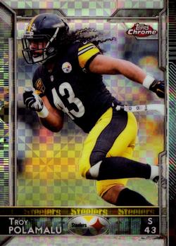
Thursday, January 11, 2018Set: 2015 Topps Chrome - Xfractors (Rate) “ The last year for Topps football. RIP ” -ketchupman36
“ I really miss Topps Chrome football. Beautiful card, great player. ” -702tpr777
“ Is this the Head & Shoulders guy ? ” -uncaian
“ I am pretty sure this was the last year that Topps had an NFL licence. Very sad as Panini has gotten very stale. ” -carthage44
“ Nice card. This was my favorite of the latter years of Topps, though i dont think i own any chrome. I like it. And Steelers uniforms, like Pirates uniforms, always look nice on cards. I never even made the connection until a couple months ago that Pittsburgh Steelers, Pirates, and Penguins all have the same team colors. ” -switzr1
“ Great player. All-time great Steeler and probable HOFer. In terms of the card, I'd like Chrome a lot more if the cards didn't buckle and bow. ” -mkaz80
“ The refs screwed the seahawks in 2005. There got it out of the system. That said, actually a nice modern card, although i am not a fan of chrome. And on the back, i do not like the number not in the upper right hand/ left hand corner. Petty, I know, but I prefer it there when shuffling through cards. ” -parsley24
“ I reluctantly admit that I think this card is pretty cool. ” -Vvvergeer
“ Signature hair flowing out of the helmet. Love it! ” -Sportzcommish
“ Great Card! Wish he was still around. ” -Quinn820
“ This is head and shoulders above the other football cards I've seen. :) ” -vrooomed
“ Loved watching him play in Pittsburgh, he fit the mold of that Dick LeBeau defense perfectly. Nice looking card BTW... ” -rmitchell6700
|

Wednesday, January 10, 2018Set: 2003-04 Upper Deck Finite (Rate) “ The Finite brand was entirely serial numbered....every card in the set in both years it was done. As someone with a serious serial number addiction, I loved the concept then and I still do now...just wish they had better designs. ” -Billy Kingsley
“ This pose is so weird, I thought it was a Kosta Koufos card at first. The words across his legs looks bad. Real bad. ” -switzr1
“ Is his name under the size 128 font "Finite Rookie"? That I can read, but the scribble below not at all. But I hope it's the player's name that goes there. ” -kents_stuff
“ Nice design. Quirky picture. ” -Sportzcommish
“ What an awkwardly posed picture ” -Brimose
“ More Finite please! Love these cards! ” -carthage44
“ Ok Keith, wow you were the 43rd pick huh, very cool. I know this is your first rookie card photo shoot, and I dont know basketball, so i guess you could say i am a rookie too. Here let me pose you like the last kid who would ever get picked in recess kickball throwing a baseball. Ok, great, now act like you are going to shot put it. great, great job. "NEXT." In walks Malick Badiane, 44th pick of the NBA draft. ummm, yeah sir can i help you.... are you lost. "NEXT!" Oh Matt Bonner. Wow, you are gonna be a super star... oh wait, Im sorry, i thought you were Matt Carrol. You guys all look alike. ” -parsley24
“ Trying but can't find anything really nice to say about this one. ” -captkirk42
“ Looks like they made about 1500 too many of these cards. Odd pose; wasted space; huge brand logo across the picture; dull; weird background; same picture on back, where there's even more wasted space; and I don't see the position he plays anywhere on the card. Other than that, perfect! ” -Vvvergeer
“ There is a lot I don't like. The photo angle makes him look like he has a tiny lower body and huge upper body, and the gigantically baggy clothes worn in the late 90's/early 00's only contributes to the effect and the mess that is this card. At least the coloring is good and the SN is cool, but then the hard to read and overly large Finite Rookie stripe reminds me that I don't like this. ” -muskie027
“ I like the feel of the Finite Rookies, though it is a bit busy. But whenever I look at these old school numbered cards the 'dot matrix' numbers really turn me off. ” -Ratsdm
|

Tuesday, January 9, 2018Set: 1922 W573 Strip Cards (Rate) “ HE caught a no hitter for Dazzy vance, so thats cool ” -Bargunmaster
“ It's a Strip Card, so I'm afraid to look at the back. I love the front though, and just enjoyed the quick read of his Wikipedia page. Dude played in the Kitty League, which was in my neck of the woods, and of course had some incredible team nicknames. ” -switzr1
“ Two super vintage baseball in a row. May not be "my sport", but it sure is fun to see them! This card predates my grandparents! ” -Billy Kingsley
“ Great Caesar's ghost, what a beauty! ” -rmpaq5
“ Ooh another vintage vintage card. Very nice. Love fragile vintage cards. ” -captkirk42
“ It's De-Card. What's not to love about this vintage card? I'm sure it's out of my price range, but I shall look into this set. I was not aware of it. ” -Sportzcommish
“ Another true vintage card (not the 1970s "vintage") and another style I'd really enjoy having in my collection. As of right now, my oldest card product is 1951, so I'd probably venture into the 1940s first, and work my way back - unless a good deal on something earlier falls in my lap. ” -vrooomed
“ Cool old card ” -cjjt
“ Some REAL classics a couple days in a row. Nice! ” -carthage44
“ oooh, mega old cards twice in a row, good job 2018 ” -Lennoxmatt
“ Amazing photography. Timeless historical value. ” -parsley24
“ I missed yesterday but I think this makes two pretty awesome pre-World War II cards in a row. ” -jasongerman9
“ Here we go! I love the vintage cards. They're so good, that all the companies are making retro versions of their current cards. Beautiful frame; nice picture; name, position and team on front. If this had stats on the back, it would be perfect. I don't even have something funny to say. ” -Vvvergeer
“ Are these like tobacco cards? Cause I have never heard of this set before. ” -MLBaseball
“ Wow, is this two of the old stuff in a row. RCOTD is on a hot streak with awesomeness!! I love it. ” -muskie027
“ As much as the modern day sets try to capture the beauty of the vintage sets, they totally fail. Its pictures like these that give me great love for TCDB, I get to look at cards that I know I could never afford to collect. See cards I never knew existed. ” -YoRicha
“ Awesome. Just a beautiful card concept, from when it was original. ” -kents_stuff
“ Whoa, another beauty! Would love to add something from this set to my collection. ” -marcbrubaker
“ More vintage baseball! The border is a little busy but still, vintage. ” -IfbBirdsCards
“ 96 year old card thats pretty cool ” -Thunderfoot
|

")