
Random Card of the Day |
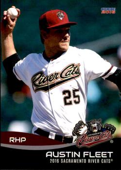
Saturday, September 19, 2020Set: 2016 Choice Sacramento River Cats (Rate) “ Nice minor league card. I like it. ” -switzr1
“ not a bad design for a minor league set ” -Thunderfoot
“ Beautiful card . . . ” -georgecf
“ river cats is a pretty cool name ¯\_(?)_/¯ ” -torald
“ Nothing fancy. I like it ” -BasketbalHQ
“ Very nice minor league card. NO complaints on this one. ” -captkirk42
“ A very solid minor league design! Can't find a single thing about this card that I don't like. ” -IfbBirdsCards
|
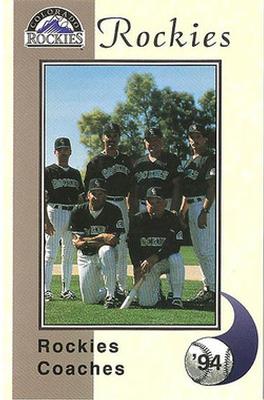
Friday, September 18, 2020Set: 1994 Colorado Rockies Police (Rate) Card: #NNO '94 Rockies Coaches “ Rockies 2nd year. Bunch of former players on staff. I loved the idea of the expansion teams when I was 12-13 years old. Had a purple Rockies shirt too. ” -rich1516
“ Nice card and a rare bird at that. A police set AND a Coaches card. ” -captkirk42
“ Maybe if the photographer had stood on the other side, we could see their faces. ” -switzr1
“ Had no idea former Met Larry Bearnarth was the Rockies' pitching coach. I love coach and manager cards! ” -mkaz80
“ I like the coaches cards in these types of sets. Strange to see Dwight Evans in Rockies attire. ” -tenlbpain
“ Nothing special, but I like it. ” -BasketbalHQ
“ Cockies Roaches ” -ganondorf666
“ Design is okay. Photo looks a bit unfocused. ” -Phil
“ Awesome! Go Rockies! They played at Mile High Stadium that year. ” -cjjt
|

Thursday, September 17, 2020Set: 1993 Eclipse Beverly Hillbillies (Rate) Card: #14 Problem Bear - No. 1 “ found out more about the clampitts by reading the card than i knew waking up this morning. ” -parsley24
“ This type of card is simultaneously why I love collecting and why my wife hates my collection. ” -jackal726
“ Haha, what a realistic bear. I'm guessing not many of these were sold. Interesting they were produced 20 years after the show went off the air. ” -rich1516
“ Love me some Beverly Hillbillies! I'll be curious the chatter this card/set brings in this forum! ” -bkklaos
“ I got 99 problems, but this bear is No. 1. ” -tenlbpain
“ Normally I really like Non-Sport cards/sets, but this looks incredibly super plain even by non-sport standards. Needs something in writing on the front. A caption for the picture to use in case they didn't use card numbers to identify the card. Wait how the heck did they number these half the set is card no. 1 and the other half card no. 2? Oh good thing there is a checklist for the set. Strange. ” -captkirk42
“ MAN IN BED MUCH RICHER THAN I HALLUCINATES BEAR WHILE ON QUAALUDES ” -ganondorf666
“ Loved this show when my reruns would air on TV! The card design is painfully simple on the front, but it works when the back is so text-heavy. The gradient might be a nod to the "black gold" that the Hillbillies' wealth is based off of, as well. ” -IfbBirdsCards
“ There is just so much goodness in this card. A classic. I now want this set! ” -bpaul14
“ To be honest, I have no idea what this is ” -BasketbalHQ
“ Classic!! ” -mkaz80
“ Truly random! ” -cjjt
“ Weird. I thought I was looking at a dead body at first. Weird card. ” -switzr1
“ I think this may be the most accurate card for our present situation. A very nice bed too, good headboard. Never thought I would write that about a card ” -Soarin22
“ Is this a gold parallel? Lol! I can't believe the Hillbillies had a set dedicated to them from 1993. Kind of cool. ” -muskie027
|

Wednesday, September 16, 2020Set: 1995 Collector's Edge (Rate) “ Nice for a 1990s card during the overproduced years. Was Edge actually overproduced as well? Seems to be a bit rate at times. Nice front but don't like the sideways lettering. Back Hmm is that the same photo as the front only at a strange angle? Don't like the overall back design. Even though it is a little basic it looks too crowded. ” -captkirk42
“ Not bad. I've never heard of the player, but I like the design ” -BasketbalHQ
“ Former Hawkeye!!! i enjoy the look of the front of this set, back is very 90's but gets the job done ” -Thunderfoot
“ I like this set a lot ” -switzr1
“ Had a year or two with the Bills. He had a few good seasons. Card actually has a cool look to it. ” -muskie027
“ Is that the same picture slanted for the background on the back? If so, was it intentional or all they could do without a horizontal picture available. ” -vanstryland
|

Tuesday, September 15, 2020Set: 2004 Playoff Honors - Credits Bronze (Rate) “ Nice picture on the front of the card. Interesting layout on the back. I like how they took some of the physical attributes and ran them in a stat line along the side of the card. ” -CollectingAfterDeath
“ Nice looking card all around. Player name on front should stand out more. I'm guessing "credits" is one of the parallels or subsets? Playoff always had pretty good designs then they got bought out by Donruss and well then Donruss went the way of the Dodo until Panini made it a zombie brand. ” -captkirk42
“ Not a bad card. Weird that they would have such horrible lighting on the photo. ” -parsley24
“ I remember his stint with the Brewers, didn't go real well. Came over in the Richie Sexson deal. Worked out for the Brewers though as Sexson's stock was as high as it could be and I'm sure they weren't going to resign him. About as plain of a spring training photo as they could possibly get here though. Couldn't even get an action shot. ” -rich1516
“ Pretty boring. Is this like the third baseball card in a row? ” -BasketbalHQ
“ The base set is nice. I have a few Cardinals. I like the photo on this one. ” -switzr1
“ hONORS, cREDITS, tOMATOES, pOTATOES ” -ganondorf666
“ Credits? I don't see that designer and printer credited on this card. ” -IfbBirdsCards
“ not a fan of pictures that come from spring training photo shoots ” -abide
|

Monday, September 14, 2020Set: 2000 Pacific - Copper (Rate) “ I have a special place in my heart for Pacific baseball stuff. I'm trying to collect pretty much anything they did- and accumulating parallels like this as best I can. Can anyone help? ” -Dave Sosidka
“ In my personal opinion, the diamond "rookie" comment looks a bit tacky. But other than that, I kind of like this card design overall. ” -kents_stuff
“ Never heard of this guy before, but a nice vintage looking photo, overall nice card. ” -Soarin22
“ His old man was a helluva hitter. ” -mkaz80
“ I have a love -hate feeling about how Pacific did the parallel numbering on the front in many issues of 1997-2000 time frame. Not a fan of the large black & white negative pic [of the front pic] on the back. ” -abide
“ Nothing special, but not bad either ” -BasketbalHQ
“ Interesting back. ” -dollar guy
“ His dad is one of my PCs. ” -BucCollector
|

Sunday, September 13, 2020Set: 1987 Stuart Bakery Super Stars (Rate) “ I can take it or leave it. ” -muskie027
“ While I feel for bilingual cards needing to use so much space for words, the amount of additional wasted space here really dampens my empathy for them in this case. ” -kents_stuff
“ what in the free give away with a tasty cake is this monstrosity? ” -parsley24
“ For some reason, I like this card, even though it really has little to offer . . . It looks like a clean design, and even the airbrushing of team logos doesn't bother me, although I usually hate it . . . For a company issue, I like it . . . it's pretty good . . . ” -georgecf
“ I like this card. Not the best, but I like the overall design ” -BasketbalHQ
“ As good if not better than today's Panini baseball cards. ” -mkaz80
“ Nice food issue. Unlicensed blank hats and helmets UGH. Actually blank batting helmets don't look so bad, but these hats with the white front panel and color sides look strange and too generic. The set does have some guys without a hat or helmet, but most seem to be wearing this style of hat. Guess the "junior" style of hat was popular in '86/87. ” -captkirk42
|

Saturday, September 12, 2020Set: 2005 Topps Updates & Highlights - Barry Bonds Home Run History (Rate) “ Ew. ” -royals
“ I like big numbers and I cannot lie. ” -Billy Kingsley
“ Ah, yes...Home Run History. One of those sets where we'll use the same images over and over and just change a few words. Like Yankee Stadium Legacy (or whatever it was), but worse. Too much dead space. ” -kents_stuff
“ so so so many Bonds cards.........I will give this one it's due. It does look nice with the fireworks in the background. Pretty sure there was no need to detail ALL of his homers though ” -Gator415
“ I like that these at least have the unique data on the back (as opposed to just recycling 5 images in front of different numbers) ” -jackal726
“ Ugly. Nice concept and nice try, but it just doesn't work. ” -georgecf
“ Love the milestone cards. I'm definitely interested in this card ” -BasketbalHQ
“ These Topps HRH insert sets in Topps flagship and Chome, are a fun chase for the guy that has a PC of the player. though Bonds is not my guy. ” -abide
“ An entire set dedicated to one player. That is not what I really want to see. ” -dollar guy
“ Nice Little set from the home run champ.... ” -parsley24
“ I was never much of a fan of these special type cards ” -Phil
“ Well, he cheated ” -Soarin22
|


")