
Random Card of the Day |
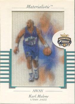
Sunday, August 9, 2020Set: 2001-02 Fleer Focus - Materialistic Away (Rate) “ This looks awesome! ” -muskie027
“ This was an interesting concept, but didn't really work out as well as I think Fleer had hoped. This is NOT a game worn jersey piece- it's just fabric, of a similar type that jerseys are made from, with the player's image printed on it. The Away version is much more common than the Home version, I've never been able to hunt one of them down. The real card is also much brighter than this, the borders and back are bright white, this is a very washed out scan. ” -Billy Kingsley
“ Focus? Ha! ” -Young Kilo
“ Never seen a card like this. Looks like the front images are on a canvas or jersey material. It is an interesting card. ” -CollectingAfterDeath
“ Weird insert. probably not needed. Could only imagine the pitch meeting on this insert: * now hear me out, you cant really tell who it is in the material.... that is what makes it unique. ” -parsley24
“ I'm sure the color fades over time with this card. Not a fan. ” -CardFlipper1974
“ I have no idea what this card is suppose to be. I don`t collect basketball so I don`t know who this is. ” -dollar guy
“ I don't like this card design, doesn't make sense to me ” -BasketbalHQ
|
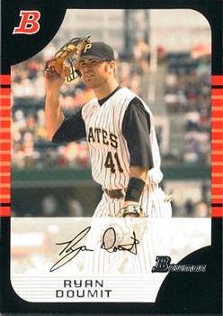
Friday, August 7, 2020Set: 2005 Bowman Draft Picks & Prospects (Rate) “ I kind of like this design. I would have made it so the entire Bowman logo fit into the black semicircle, though...it looks like it's off center with the way it was done. ” -Billy Kingsley
“ Dreadful card Bowman never fails to give me a bit of a headache, but at least a Bucco HOORAY! Side note, the only pinstripes that looked good on the Pirates were the ones from the late 70s Family Buccaneers, ” -Gunny
“ a little bit too plain for a bowman. Not a fan of the black borders. ” -parsley24
“ I like the card. Nice picture & nice way to do the autograph. Back has a lot of information & a different picture. HATE the numbering system. ” -cjjt
“ I like this set, other than the white box with the fake signature. ” -switzr1
“ Oh so close. Just thinking how near perfect of a design and look this card, as well as the other cards in the set, would have had, if not for the faded out area with the facsimile auto. Still a good looking card, imo. ” -CollectingAfterDeath
“ I like Bowman for Basketball cards, but the dark border colors don't really work with the lighter, outdoor colors. ” -BasketbalHQ
“ A little bit of a unique photo. A catcher holding his mask but without a chest pad or shin guards. Not a fan of the design however. Is that supposed to be a baseball field in the lower right-hand corner? The border reminds me of Donruss in the late 80s. ” -vanstryland
“ One of my least favorite sets by Bowman, the edges seemed to always flake white and the logo appears twice on the front. ” -XxCajunCannonxX
“ Well this would look much better if it wasn't an autograph card. ” -Phil
“ I remember Doumit, he had a decent season or too. The card looks somewhat dull. ” -muskie027
“ Pretty average card. ” -dollar guy
“ One of the worst Bowman designs ever. Hate these cards and the guy or girl who designed them. YOU, Sir or Madam, suck. ” -CardFlipper1974
|
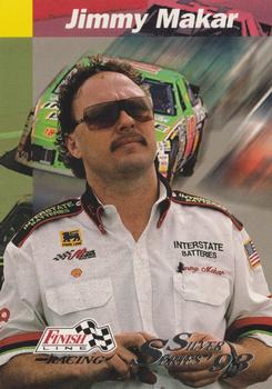
Thursday, August 6, 2020Set: 1993 Finish Line - Silver Series '93 (Rate) “ A somewhat local guy to me! Was the winning crew chief of the first race I ever saw. Multiple Cup titles to his name. Still involved in the upper level of Joe Gibbs Racing. This was tied as the first parallel in NASCAR history, one per pack. ” -Billy Kingsley
“ Jimmy having a Days of Thunder moment, while thinking of how to make the car better..."I'm gonna give you an engine low to the ground... extra thick oil pan to cut the wind from underneath you. It'll give you thirty or forty more horsepower. I'm gonna give you a fuel line that'll hold an extra gallon of gas. I'm gonna shave half an inch off you and shape you like a bullet. You're gonna be perfect." I like the change of pace with the crew chief on a race card for RCotD. Nice card! ” -CollectingAfterDeath
“ Not an auto racing fan, but I really like this card . . . Nice portrait photo against an in-action photo, and a different facial photo on the back . . . Nice use of colors, also . . . Very good-looking card . . . ” -georgecf
“ certainly looks like a race car driver ” -DarkSide830
“ Nice race card. ” -captkirk42
“ Not a Racing fan but this is decent. Nice picture of the driver and pretty good background. ” -Phil
“ Jimmy Makar, hmm no relation to Cale Makar right? Overall I have no idea how to comment on racing cards ” -dollar guy
“ Nothing too fancy, I like the racecar in the back ” -BasketbalHQ
“ I walked by Jimmy at Bristol in '00. Asked him if Bobby had the car to win that day. Jimmy looked at me and my son and said in the calmest voice, "I wouldn't drive that POS to the grocery store." They won the championship that year. I love racing cards, always great designs. ” -CardFlipper1974
|
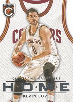
Wednesday, August 5, 2020Set: 2015-16 Panini Complete - Home (Rate) “ Kevin Love is actually a distant cousin of mine! Really distant- you have to go back to the 1300s to find a common ancestor. But still, he's blood related. His uncle is Mike Love of the Beach Boys. He's a second generation NBA player, his father Stan played for the Bullets. When I am looking to add the missing sets to my collection, (for my project of having at least one example of every set) it's his cards I look for from current sets. ” -Billy Kingsley
“ I like the card but, I don't like home teams in white kits. ” -Gunny
“ Good shot of Klove and nice basic back. pretty sharp card! ” -Gator415
“ Fun concept card. ” -captkirk42
“ um... I'm going to go out on a limb here and say that the addition of Love had virtually zero to do with the attendance increase mentioned on the back of the card... at least they also threw in that 'oh yeah, Lebron is back in town also' ” -Brimose
“ Great looking card. Love love... What i dont love about love is that he models for Banana Republic. As a larger man, 6'2" 250+, i cannot find a lot of the clothes there that fit me. There is no way a giant like kevin love can shop there. This frusterates me to no end. ” -parsley24
“ I don't mind these. I liked the Panini Complete sets, and these were decent inserts to pull. ” -switzr1
“ I really like the concept of the jersey here with the name on the back, but I'm not sure it works with the home attendance subset theme. I'd rather see this as a base card look with personal stats on the back. ” -vanstryland
“ I like the cards with the jersey in the back, but the label at the bottom isn't great, makes it hard to read ” -BasketbalHQ
“ Jersey in the backround? Photoshopped card once again. ” -dollar guy
“ I loved Panini Complete. Wish they never got rid of it. It was such a nice set for basketball. I miss it. ” -muskie027
|
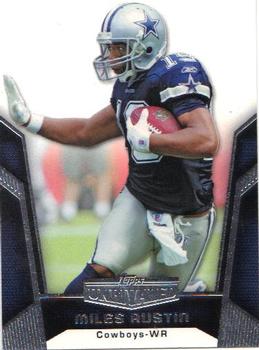
Tuesday, August 4, 2020Set: 2010 Topps Unrivaled (Rate) “ I like this card. Topps Unrivaled lasted only a year. Miles Austin did have a couple of good years with the Cowboys. ” -Brendan Barrick
“ The walls are closing in on him like in the trash compactor scene in Star Wars. He must hold them back. ” -UKboogie
“ Actually, this photo is framed well with the graphic around the bottom and sides. That doesn't happen all the time. Nothing fancy, but not bad either. ” -Brimose
“ great looking panini car....... whaaaaaaat ” -parsley24
“ Prizm's are starting to feel really generic. Some of the parallels are fun and unique, but there are so many it is hard to gauge what they are, let alone value. ” -weekendroady
“ Too much silver on front, the "roulette wheel ball trap" frame thing has Miles trapped. Back is actually pretty good. ” -captkirk42
“ Miles poses for a Heisman Trophy photo op. All kidding aside, this card just feels bottom heavy, like it has an anchor on it...oh wait, it actually does. ” -CollectingAfterDeath
“ Really standard card in my view. I have nothing else to say about this card ” -dollar guy
“ Finally a non-shiny card for Card of the Day. Nice simple card, I tend to like Topps more than other companies ” -BasketbalHQ
“ At first I thought it was a Prizm design. Maybe cause the RCOTD was Prizm when this popped up? It is nice looking. ” -muskie027
|
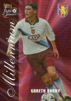
Sunday, August 2, 2020Set: 2000 Futera Fans Selection Aston Villa (Rate) “ Not really a soccer person, so naturally I have no idea of he is, but I like the design in general ” -BasketbalHQ
“ Holds the record for most appearances in the Premier League. ” -fedoratipper
“ I wish I collected more soccer over the years. ” -muskie027
“ Gareth Barry at 39 years young is still playing, now with West Bromwich Albion in the Championship. I have some of the Arsenal, Liverpool and Celtic cards in this line but none of the Aston Villa ones, I need to fix that. ” -Gunny
“ Why a photoshopped backround? And no stats? Not a card I would like in my collection. ” -dollar guy
|
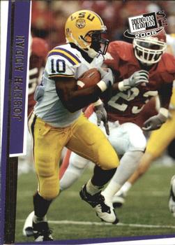
Saturday, August 1, 2020Set: 2006 Press Pass SE (Rate) “ Nice and simple, good design ” -BasketbalHQ
“ An ok design. ” -Brendan Barrick
“ The picture looks like it can use more definition. C- ” -Phil
“ Not a bad card. Was he really in college 14 years ago. I really thought he was more recent. God I am getting old. ” -muskie027
“ No idea what to say about this card other than it has a decently long write up. ” -dollar guy
“ Nice photo. I love college football cards that don't airbrush out the logos. This is a quality card. ” -switzr1
“ kind of a late 90s funky design... not a fan ” -parsley24
|
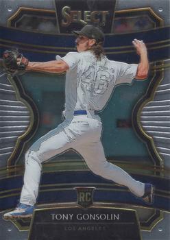
Friday, July 31, 2020Set: 2020 Panini Select (Rate) “ Nothing special, not a bad card at all ” -BasketbalHQ
“ Panini Select, the Cadillac of trading cards with a performance package. ” -CardFlipper1974
“ I really liked the soccer Select stuff. The baseball needs the licensing. Without that this card is just.........blah. ” -Gunny
“ Quick turnaround for RCOTD. ” -jupiterhill
“ This is a really bad baseball card. It should be removed from existence. But my mom always told me to try to find the good aspects things. Here's one. At least they don't have to airbrush out the Dodgers logo on the front of the jersey. So that's a positive for an unlicensed company! And even if the front side were showing, it would have been easy to remove the white logo on the white jersey from those hideous white on white uniforms. So many positives for Panini to be thankful for. ” -bpaul14
“ Really??? . . . Design looks like a school project from the elementary school-level . . . To think someone got paid to "create" this design . . . A nice design can be really striking . . . this one is sickening . . . ” -georgecf
“ The front design is pretty dark. Seems interesting but i will pass ” -dollar guy
“ Nothing to right home about. A lot of these cards look the same nowadays. ” -Phil
|

")