
Random Card of the Day |
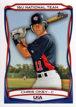
Thursday, December 19, 2019Set: 2010 Topps USA Baseball (Rate) “ Good photo, not a bad design, I just really prefer cards of MLB players. ” -chvlDm
“ Great card. ” -parsley24
“ So Chris is just OK? Nice looking card but personally I don't like the USA team cards of any set. Unless it is of one of my super PC players I try to avoid these things. Most of the players were never drafted and only have these Team USA cards, although now days a single player has 100s of cards even if they only have 1 card due to the overexess of parallels and planned variations. ” -captkirk42
“ Okey Dokey. ” -rmitchell6700
“ Not bad at all. A decent design with a nice photo. Plenty of info on the back. Not much more could be expected (or asked for) from a USA Team card. ” -spazmatastic
|
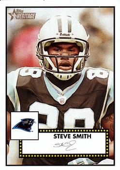
Wednesday, December 18, 2019Set: 2006 Topps Heritage (Rate) “ Topps has such a vast history of designs, but almost never crosses sports (or sports with non-sports). An almost untapped field...it's nice to see on the rare occasions when they do it, as is here. ” -Billy Kingsley
“ This card packs a punch. ” -parsley24
“ I know it's been used and abused over and over again, but I'll never get tired of this classic Topps design. I kinda wish they had used this template for the Living Set, even at the expense of the artwork. ” -mkaz80
“ Love this Heritage set. Even though it is based on a baseball design. I definitely need to complete my team sets of the Skins and Rams maybe even go for the full base set. ” -captkirk42
“ Decent design but don't like that it was also for the baseball set and I don't know for sure but probably basketball and hockey as well. ” -davidhandberry
“ 2005 heritage was one of my favorite sets of all time they used like 5 different classic designs, shortprints, and rookie variations, but when 2006 came out I was kinda disappointed they only used the one design, I did like the looks of it though and was disappointed when they didn't bring back heritage in 2007, also one of my favorite parts of heritage was the thick non glossy cardstock ” -Thunderfoot
“ Really nice looking card. The color looks off, I can't tell if that is the scan or the throwback look of the card, but I like it either way. ” -muskie027
“ Too much border, not enough stats, awful facsimile auto. He was an amazing receiver for his 5' 9". Unfortunately, football players rarely have a lengthy career. ” -baseballcardstoreca
|
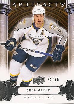
Tuesday, December 17, 2019Set: 2009-10 Upper Deck Artifacts - Silver (Rate) “ Artifacts is not my favorite brand but I am glad to see another hockey Card of the Day. And a serial numbered parallel to boot! ” -Billy Kingsley
“ Very nice looking Artifacts card Front and back. ” -captkirk42
“ I don't collect hockey, but this gives me a burst of nostalgia for the days before Topps had the exclusive MLB licence. ” -jackal726
“ I really like this, the background is great. No complaints except it being hockey, not baseball. ” -davidhandberry
|
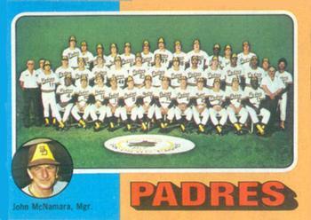
Monday, December 16, 2019Set: 1975 Topps - Team Checklists Gray Back (Rate) Card: #146 San Diego Padres / John McNamara “ A team checklist card. Now that there is a handy thing to have. I like how the manager's mug is spotlighted. Excellent concept put into practice on this excellent card. ” -CollectingAfterDeath
“ Cool team check list ” -parsley24
“ Before we had TCDB, we needed these checklist cards to help us keep track of which cards we had and which ones we needed for our team sets! ” -mkaz80
“ Team cards are always cool! ” -Billy Kingsley
“ Nice team photo. Not thrilled with the advertising on the back ” -NJDevils
“ Absolutely LOVE 1975 Topps. As a kid even though I thought I had gotten a ton of it, I didn't have that much of the set. I still don't :( ” -captkirk42
“ Love the team checklist/photo cards. Wish they remained in the flagship set each year. ” -rmitchell6700
“ My 2nd set. Bought it with my own money. I was 8. ” -cjjt
“ Love these older cards. ” -muskie027
|
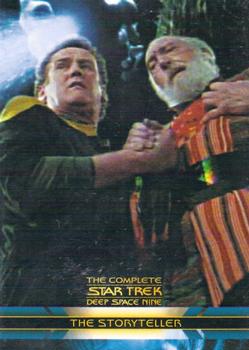
Saturday, December 14, 2019Set: 2003 Rittenhouse The Complete Star Trek Deep Space Nine (Rate) “ Kind of a cool card for non-sport. ” -muskie027
“ Very random Star Trek Deep Space Nine card. I honestly don't recall seeing this episode and I think I saw all the DS9 episodes or at least 95% of them. ” -captkirk42
|
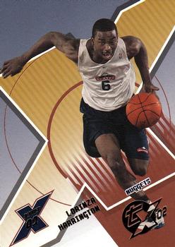
Thursday, December 12, 2019Set: 2002-03 Topps Xpectations - Xcitement (Rate) “ This is just horrible! All the diagonal text is bad, the front logos are bad, the background is bad. It looks like he's wearing a practice uniform too! And why did they compare his college stats to Payton's pro stats?! Only his blocks stat is nice. No wonder the guy wasn't drafted AND I've never heard of him. ” -spazmatastic
“ I always say that I wish Topps would be more inventive. Maybe I shouldn't wish that. Topps trying to being inventive is UG....LY. From the horizonal writing to the color scheme to the duplicate photo. If they had simply left the writing horizontal it would be a decent card but that killed it for me. ” -davidhandberry
“ Never heard of these nor ever seen any til' now. Looks very bland and fond of the letter x like Upper Deck. ” -baseballcardstoreca
“ Junior Harrington...made a big splash for a short time, then got traded and disappeared from the league. I loved this set when it was new, not so much now...but I still want to complete it some day. I need to work on the sn portion of the set more. ” -Billy Kingsley
“ Branding looks like the basketball court markings. Very odd and a bit too plain. Back would be OK if text were straight not at a weird angle. ” -captkirk42
“ I unapologetically like this card. As cluttered as it was, I miss this era of Topps cards. ” -mkaz80
“ Xcrappy Xbackground ” -NJDevils
“ Terrible. Same pic front & back. Text on back difficult to read. ” -cjjt
|
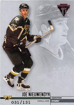
Wednesday, December 11, 2019Set: 2001-02 Pacific Private Stock Titanium - Retail Parallel (Rate) “ Glad to a numbered hockey card, but they really phoned it in on this design, or lack thereof. I do think it's cool that the scanned card is #031/131. ” -Billy Kingsley
“ Nice card. I miss the Pacific brands. Pretty cool serial number 031/131 An Ebay 1/1 LOL. ” -captkirk42
“ I was still collecting hockey at the time of this cards release and Pacific was by far my favorite brand. ” -Corky
“ After several mediocre hockey cards recently, this one is amazing. Perfection except it being a parallel. ” -davidhandberry
“ Seems kind of empty, and bland. There is no "pop" to this card. ” -CollectingAfterDeath
|
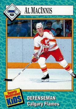
Tuesday, December 10, 2019Set: 1989 Sports Illustrated for Kids (Rate) “ SI knew that these would be a hit and they included about 9 different cards per issue that were perforated and detachable from a full page from the magazine. These covered a wide range of sports. ” -baseballcardstoreca
“ Love the SI for Kids cards. They cover sports that generally don't get any coverage, although they've gone away from that a bit lately. This is the first year and first series. They are currently on the 5th series and if they do not start a new series they will hit card #1000 in the first quarter of 2021. The second series is in my opinion the greatest sports card set ever made, due to it's wide variety of subject matter. ” -Billy Kingsley
“ I remember getting these from the magazine when I could find them. Was really difficult to get clean edges when removing them from each other. ” -Toddbwd
“ Ottawa! The Capital of Canada is OTTAWA!!! Do I win sumthin? ” -Gunny
“ Really good looking card. I like the border coloring, and the way the stick and skate come out of the picture. Very Cool. ” -CollectingAfterDeath
“ I remember these very well. My brother and I would each get half because they came in a sheet. Sadly I have lost or traded most of them away. ” -davidhandberry
“ Like these SI for kids cards. Not a huge fan of the perforated cards in a magazine gimmick but they get some slack since it is for a kids magazine. ” -captkirk42
“ Heck of a player. One of the hardest and heaviest shots ever. ” -NJDevils
“ Kind of cool. I think I have the Gretzky from this set. I really wish hockey teams would go back to wearing there whites at home. ” -muskie027
“ I ripped a ton of these and just had my parents deliver them to me. Im about to just throw them away ” -parsley24
|

")